

Atlanta Foot: Designing a Newsletter That Connects the Practice Story
A look at LICA’s newsletter design for Atlanta Foot, bringing its audience message, practice-area information and consultation call to action into one layout.
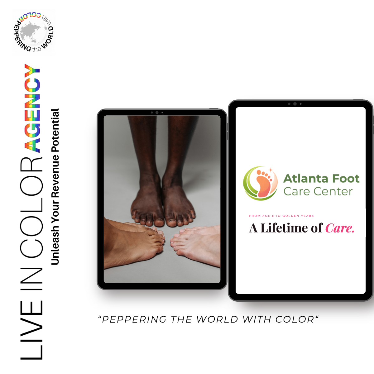
Featured image: an existing LICA brand visual for Atlanta Foot.
An email newsletter gives a practice another place to explain who it serves and how to learn more. The challenge is choosing a useful order for that information, then designing a layout readers can follow.
For Atlanta Foot, LICA completed a newsletter design that brings the practice’s audience message and service information into a consistent visual presentation. The work connects a broad introduction with more specific practice-area content and a consultation call to action.
- The work: Email newsletter design
- The focus: Audience clarity, information hierarchy and brand consistency
- The delivered piece: A designed newsletter with an introduction, organized content sections and contact details
Begin with the audience
One part of the design introduces the practice through different stages of life. The layout groups its audience information into distinct sections, making the range of people the practice serves visible within the piece.
Is Your Brand
Leaving Money on the Table?
Run our free brand audit and get a personalized report on exactly where your marketing is falling short — and how to fix it.
Run the Free AuditThat approach connects with LICA’s earlier website messaging work for Atlanta Foot. The website and newsletter can carry a related introduction while using the structure appropriate to each format.
For the design, the important decision is what readers should understand first. Establishing the audience gives the service information that follows a context.
Organize the detail
The newsletter’s practice-area layout uses repeated image-and-text groupings. Each topic has a heading, a short description and a route to learn more, allowing readers to move through the content in smaller sections.
Marketing Insights, Every Week
Join 2,000+ founders and marketers getting real talk about what's working in marketing right now.
That repetition creates a visual rhythm. Readers do not have to learn a new layout for every topic. The headline introduces the section, and the repeated units make the supporting information easier to locate.
White space, a restrained color palette and pink accents connect the sections. Photography gives the piece visual variety, while the consistent type treatment holds the information together.
Give the design a clear next step
The consultation call to action appears near the close, with the practice’s website and contact details. It follows the introductory and practice-area material, giving the reader a path from learning about the practice to asking a question.
Generate Your 2026 Editorial Calendar — Free
Stop guessing what to post. Get a full year of content ideas tailored to your brand, audience, and goals — in seconds.
Generate FreeThis is where newsletter design becomes practical. The piece needs a clear relationship between its message and the action it invites. A reader who wants more detail should be able to identify where to go.
The completed deliverable is the design itself. It demonstrates how the audience message, service information and contact route can be organized as one communication. Sending, audience response and appointment activity are separate stages from the design work.
Build continuity across touchpoints
This assignment is part of LICA’s ongoing creative work with Atlanta Foot, including website messaging and social content. Each piece has its own format, but the underlying introduction should remain recognizable.
A website may give visitors room to explore. A newsletter can bring a selected set of information into one focused communication. Good planning connects those experiences and keeps the message consistent as people encounter the practice in different places.
For businesses reviewing their next newsletter, a useful starting point is simple: decide who the piece is for, what they need to understand and where they should go next. Those decisions give the design a job to do.